Search
echoes Brand Guide
This page serves as a resource to new members of our team looking for a reference on how to style the website. It also is designed for those looking to write about echoes externally.
General Stylistic Choices
The echoes name
The name "echoes" is always stylized in lowercase and italics.
Water
Echoes and water ripples share very similar depictions, so our website design draws inspiration from water for its cool-toned color schemes, ranging from light to dark, as well as other visual elements.
Soft Shapes
We chose to use soft shapes throughout the echoes website wherever possible. Our layout features circles and cards with rounded corners. Having these soft, rounded shapes helps convey a sense of calm and relaxation while meshing well with our theme of water and community-centered goals of echoes.
Color Palette
Our color palette consists of many cool-toned colors, many of which are shades of blue, in order to continue with the themes of calm and water. The colors on the website are all shades of one of these three palettes.
Background (Surface)
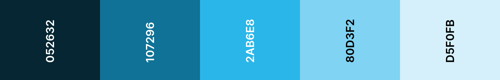
This palette is where the colors for the page background gradients for both light and dark mode are derived, as well as key interface elements like the light mode navigation bar.
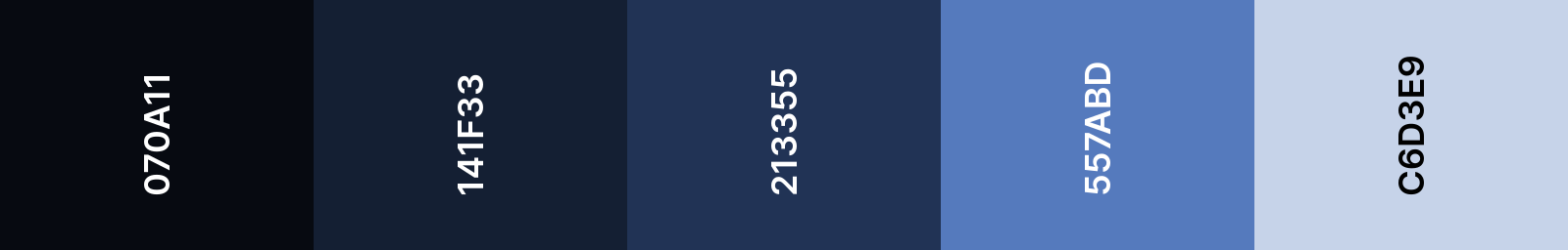
Headings (Primary)
This palette is mostly used for headings and subheadings, with the lightest colors used for headings in dark mode and the darkest as headings in light mode.
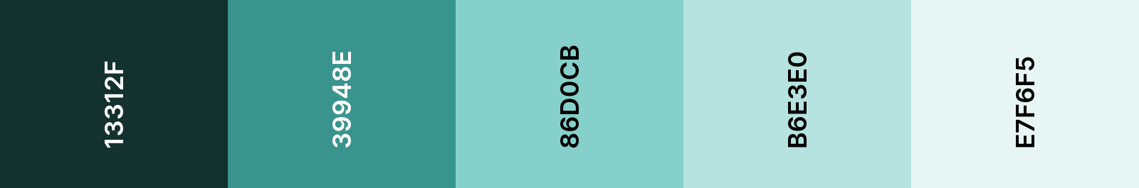
Accent (Secondary)
This palette is used with the primary palette in order to add more visual interest to elements of the website, like the cards featured throughout the layout and the dark mode navigation bar.
Font
Our website uses a sans-serif font called Inter from Google Fonts.
Text Examples
Heading 1: 48px
Heading 2: 36px
Heading 3: 30px
Heading 4: 24px
Heading 5: 20px
Body text (18px):
Lorem ipsum dolor sit amet consectetur adipisicing elit. Laborum aut, voluptates possimus doloremque obcaecati, repellat mollitia, dolores reiciendis iure accusantium natus. Doloribus aperiam expedita suscipit fugiat debitis quis est sapiente! Alias soluta molestias laboriosam adipisci nisi! Veritatis, repellendus neque doloribus tempore illum nihil ea ipsa vero culpa numquam itaque consequuntur? Quod, ipsum?
Logos
Three main logos exist for the project:
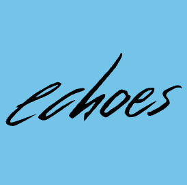
The handwritten and stylized echoes name in black
The main text logo is used primarily on title slides of presentations , usually accompanied by the text "Exploring Games as Reflections of Our Community". It is also the banner image of the website.
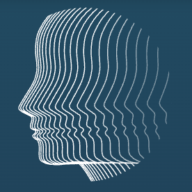
A line face that repeats out as it transforms to water ripples
This logo is generally used as a hero image, both on the main page of the website as well as in presentations. It is usually accompanied by the text logo.

A small recursive square with echoes in the middle
This logo is mostly used next to the echoes name in external presentations to mark our brand. It is also the favicon for the website.
Videos
Here you will find promotional videos of echoes for your reference. Use these to model your own articles and presentations off of, as well as future promotional videos.
For more videos, feel free to visit our Youtube channel.