Search
Concept Art: Room for Growth
Miranda Lenaghan , 3/25/2026
Room for Growth Concept Art
Room for Growth is a game project currently in development about taking care of a plant which will always die no matter what you do. In this blog post, I’ll be going through the process I followed in order to create concept art for this game.
Phase 1: Inspiration and Research
The previous game I worked on for echoes was Hush, which I joined as a 2D artist about halfway through development. Where Hush already had a pre-defined artstyle I simply had to follow, it was now my job to find an art style that would suit Room for Growth.
The research phase began with finding photographs that matched what we were going for: potted plants on apartment windowsills. Similarly, we also looked at other cozy plant games for inspiration. The team really liked the way light filtered in through windows, as well as the ability to see other buildings in the distance to create a sense of community. These visual features ended up being core design aspects for future concept art iterations.
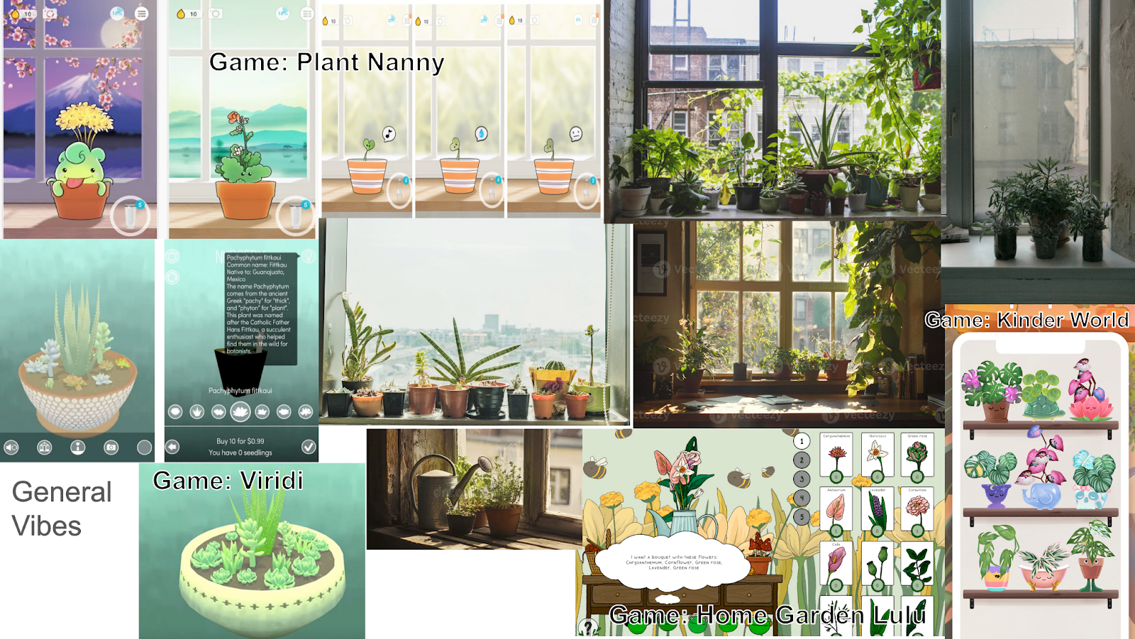
Our initial moodboard featuring photos and screenshots from other plant games.
With some initial visual inspiration in mind, the next step of the research phase was to find an art style which would suit our project. Though Room for Growth is ultimately about failing to take care of a plant, leaving them feeling frustrated, we wanted to bury the lede. This meant that the art style should contrast with that feeling of exasperation - it should be misleadingly cutesy (initially, anyways). Our team looked at pastel pixel art styles like Merrigo’s, illustrative styles with vibrant colors like the work of Ayako Ozaki, but ultimately fell in love with the style of Em Kessler’s illustration work. The simple yet expressive nature of the illustrations, the slightly geometric feel of figures and landscapes, the color and lighting work — it perfectly suited the vibe we were aiming for. With these traits in mind, I got to work.
Phase 2: Initial Rough Concepts
These initial concepts were mostly for the purpose of establishing an “initial vibe” and seeing what the team liked in terms of color direction and contrast. The style in this phase is loose and sketchy — not at all like the style we had all agreed on, but something that could be used to quickly receive feedback.
For this phase, I started off with a black and white value study and then added color later with gradient maps and an overpaint color layer.
The team’s favorite ended up being the warm version in the top left, feeling like warmer colors had an autumnal feeling which enhanced the game’s “dead plant” theme. The darker and more desaturated versions, on the other hand, would perhaps better fit the late game when the plant is dying.
With this in mind, I moved onto the next phase.
Phase 3: More Formal Concepts
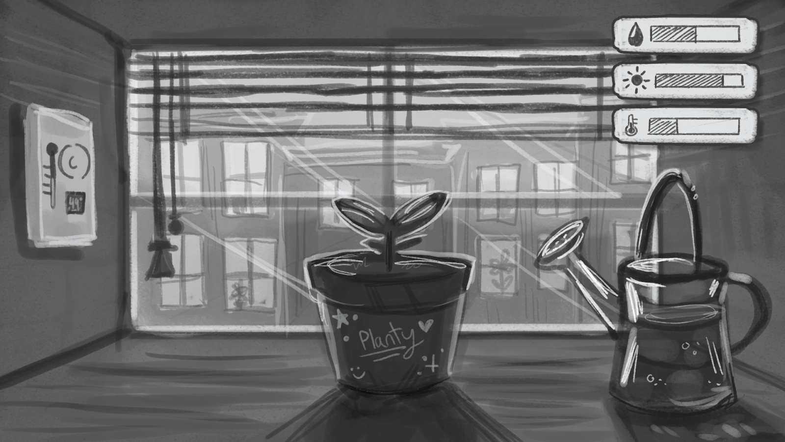
While this phase was mostly focused on nailing down art style, there were also a few other things I had to consider. For starters, my fellow concept artist Ziyin Zhang had also shown off concept art in the previous phase and the team had to decide which direction we wanted to go in. Ziyin had presented a scene depicting an entire room in dreary light, while I had focused solely on the windowsill. Moving forward, the team had to decide on a unified scene setup. I quickly sketched a few composition ideas zoomed into the window. The team ultimately liked the first option — the closest to the windowsill — best.
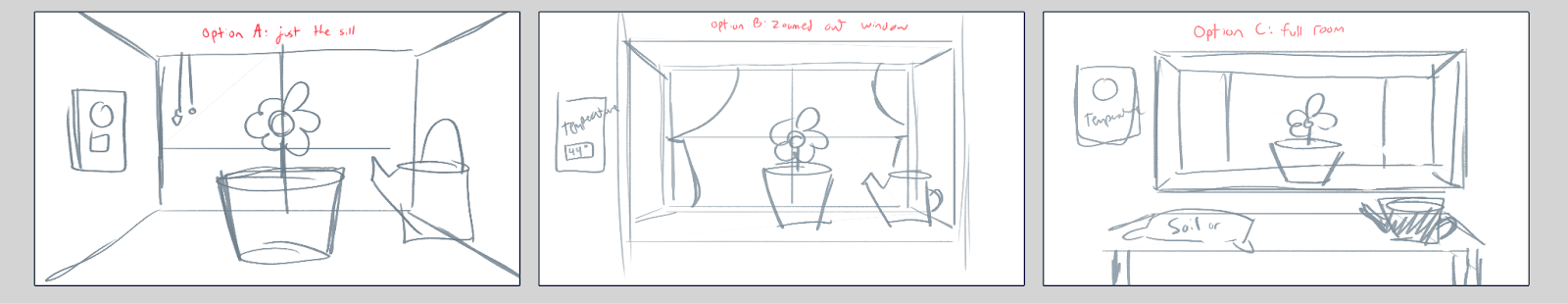
Secondly, in my initial concept art, I had included meters showing off the plants’s stats (water, light, temperature) while the game designers had been imagining that these stat bars would be invisible to the player and "secretly" tracked. That meant that in my next round of concept art, I would remove these stat bars and only include their visual/mechanical representatives (watering can, window blinds, and thermostat).
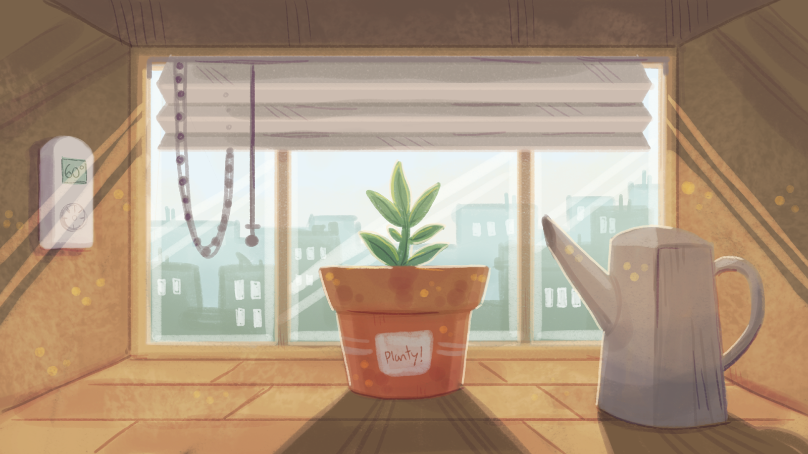
With all this in mind, I created the following concept illustration:
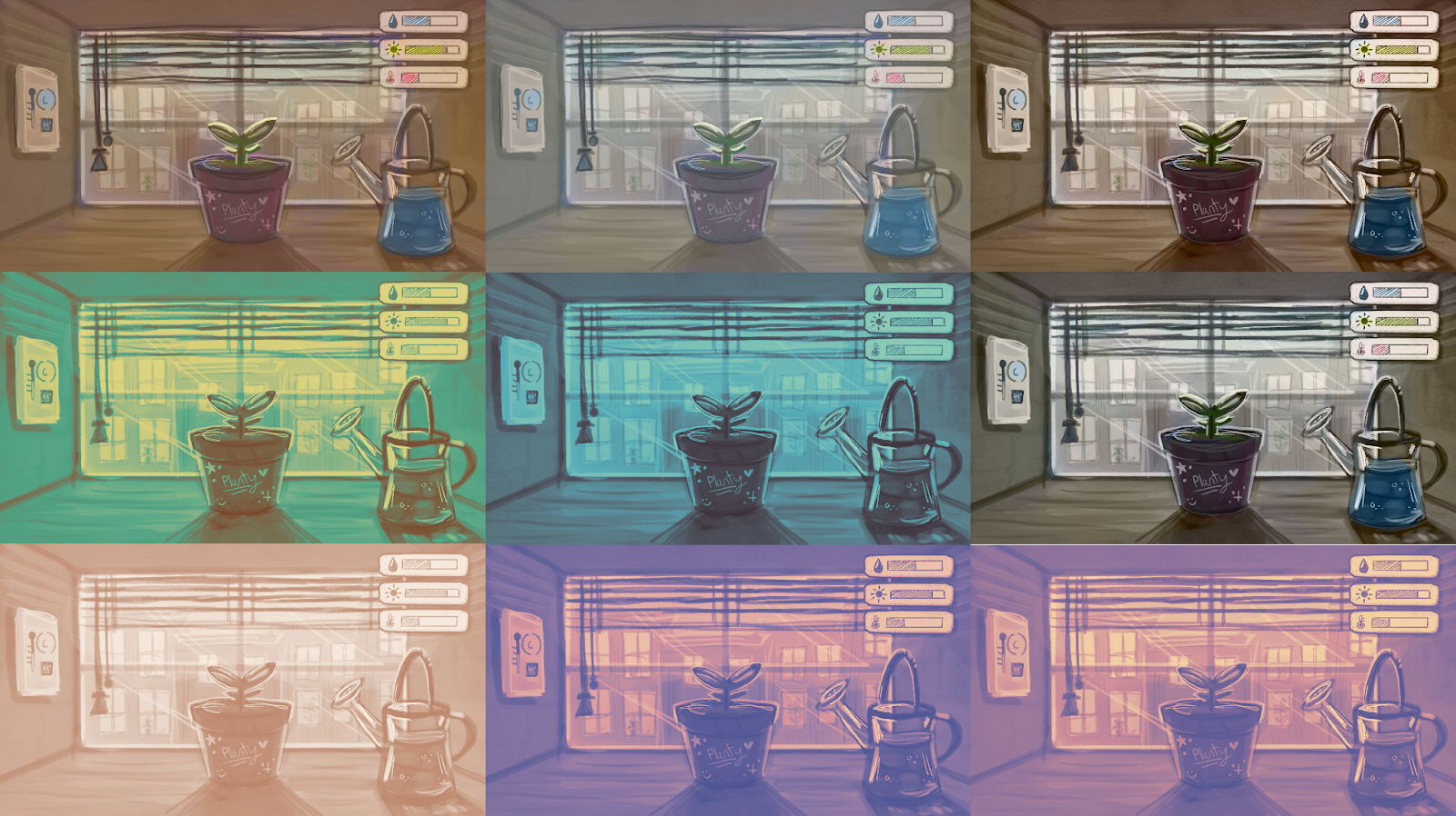
In addition, I also created three color variations of an dead plant endgame illustration inspired by Ziyin’s work.
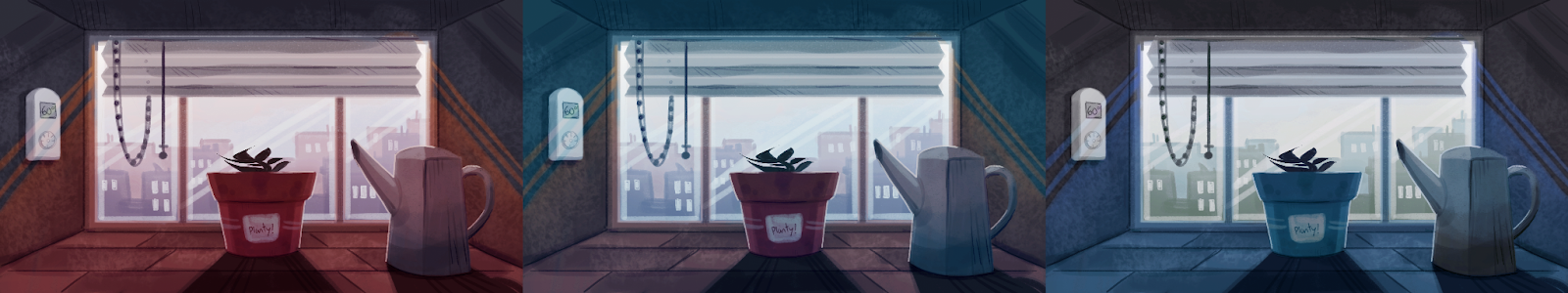
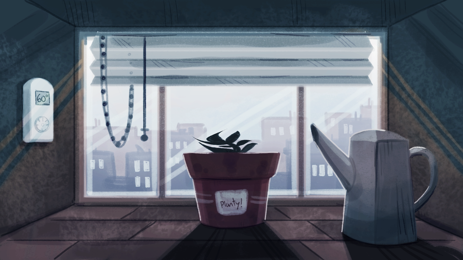
The team thought that the first red version was too ominous, while the third blue version was too melancholy. The middle version was best and everyone liked the white window, but it was still too saturated. With all this in mind, the team ultimately landed on THIS desaturated version to be our final color palette:
Phase 4: Concept Revisions
Though the last set of concept art illustrations were certainly a step in the right direction, there were still things to fix. While the team loved the color palette, composition, and lighting of the previous illustrations, they thought the scene aspects themselves could be blockier with harder lines in order to more closely match our original style inspiration.
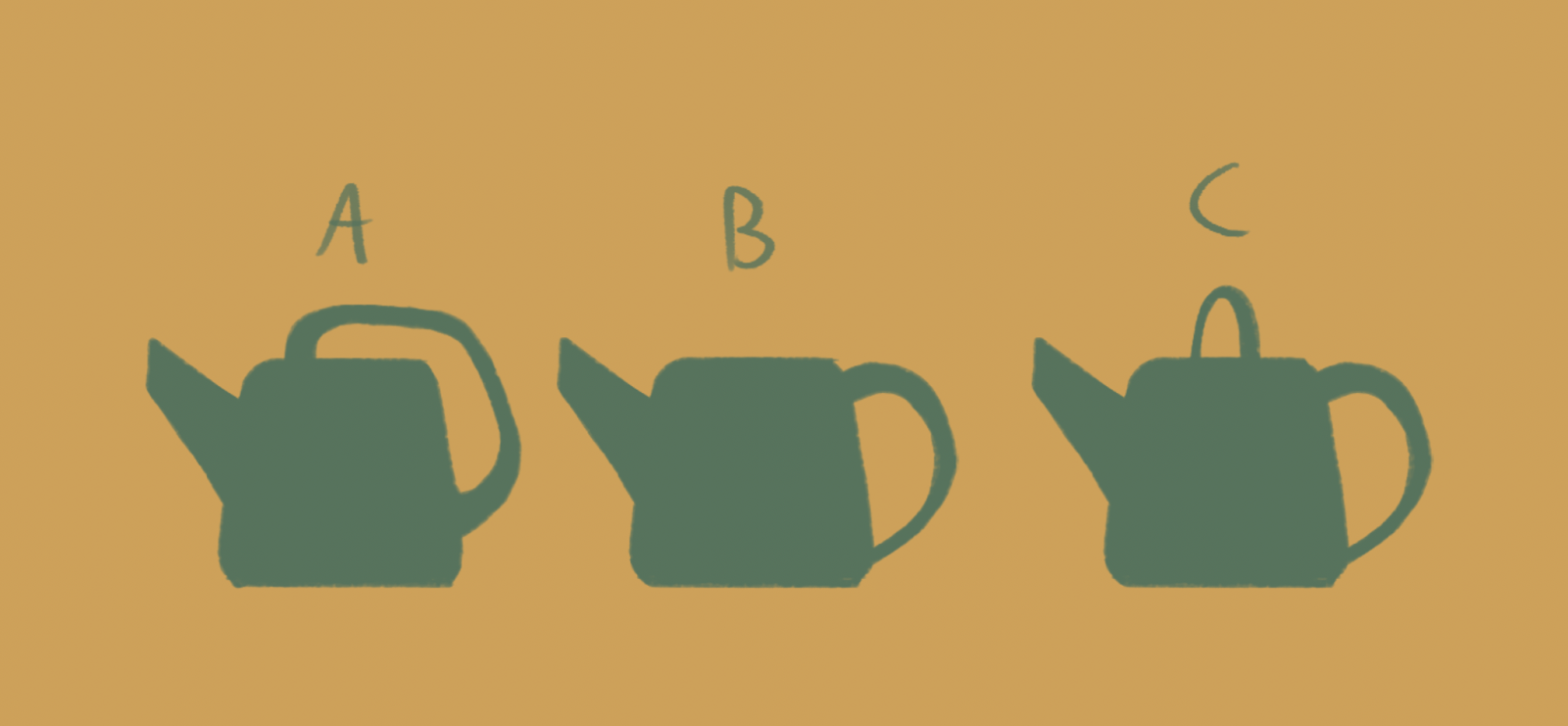
The first and easiest change to make was to change the shape and style of the watering can (the first one looked a little too much like a coffee maker…):
With a new watering can in mind, I got to work on a new set of art.
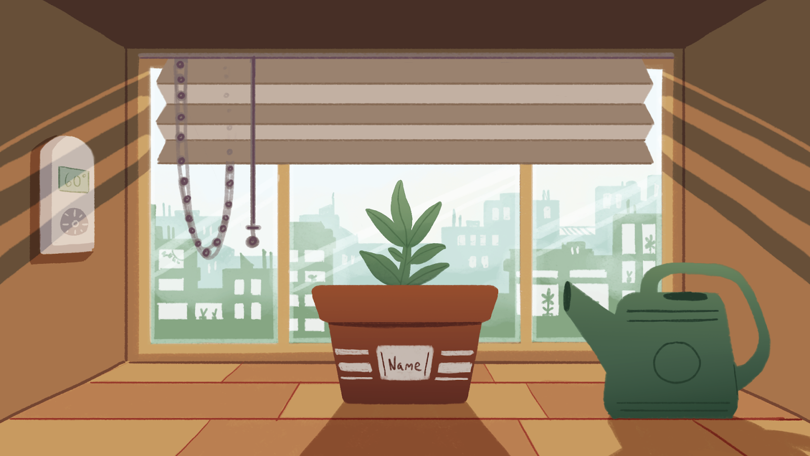
I started off with a flat texture:
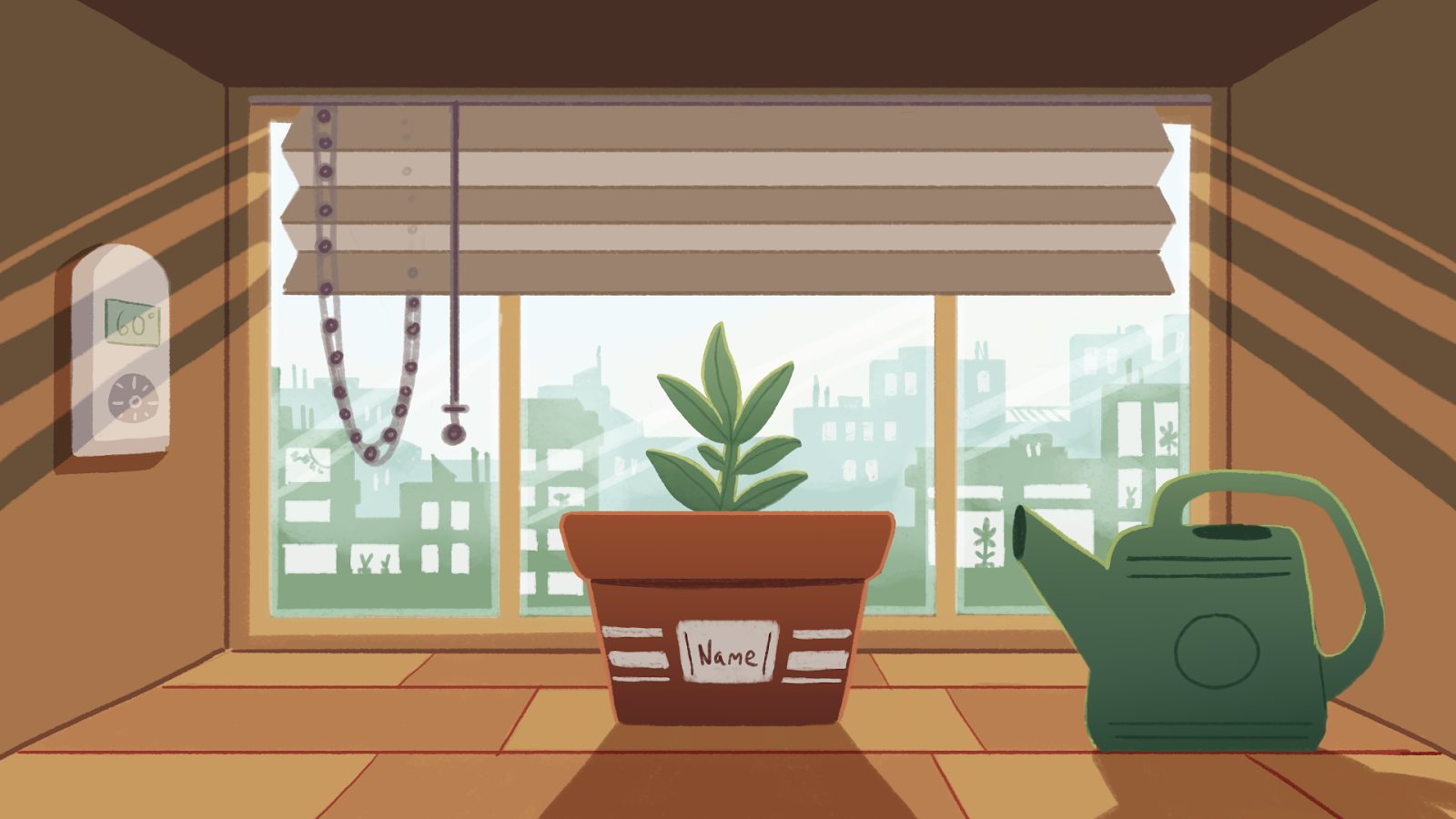
Then added some rim light to the plant, pot, and watering can:
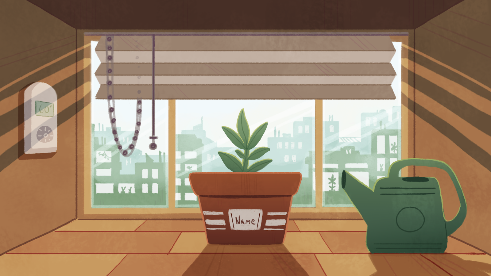
Then added some overlaid texture onto the scene:

Then finally added some cross-hatching line details into dark areas to add to the sense of dimension and detail:
And this is the stage I’m currently at!
Wrapup and Final Thoughts
Room for Growth is still in development, so it’s fairly likely that the final art you see for the game will still be different from what I’m showing off in this post. Ultimately, the point of concept art is to help create an identity for the game and guide future artists down the right path. The entire point of concept art is to explore every single visual option until you’re sure you have the best one. Even if the final game ends up looking nothing like the art I’ve shown here, it will still have done its job!