Search
The Making Of The echoes Brand Guide
Logan Potter , 04/24/2026
Introduction
Hello echoes community! My name is Logan, and I joined the echoes web team this semester. One of the coolest projects I got to work on this semester was the Brand Guide page of this website! It was so cool, in fact, that I made a slideshow about how I made it and presented it at an echoes All Hands meeting. But after the presentation, I thought that it would be pretty cool as a blog post too! What follows is the entire presentation I gave at an All Hands meeting on the 2nd of April 2026, but in blog form. Enjoy!
What we started with
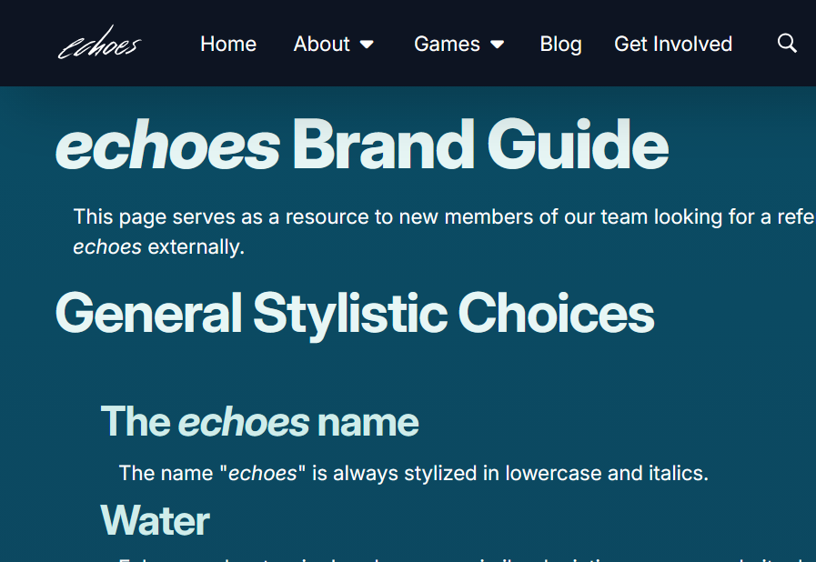
When I started on echoes in January, we actually didn’t have much written down formally in terms of branding. It was one of the biggest things I noticed during onboarding and into when I started working on implementing different components of the website. The cool thing about VIPs like echoes is that, if you have a good idea about how to improve your team’s project, you can probably work on implementing it yourself! That’s how the idea for a comprehensive, public-facing brand guide came about. We had the beginnings of one on the “website info” page, but a lot of the info was vague or incomplete (or both). Here are some images that illustrate what I had to work with at the start.
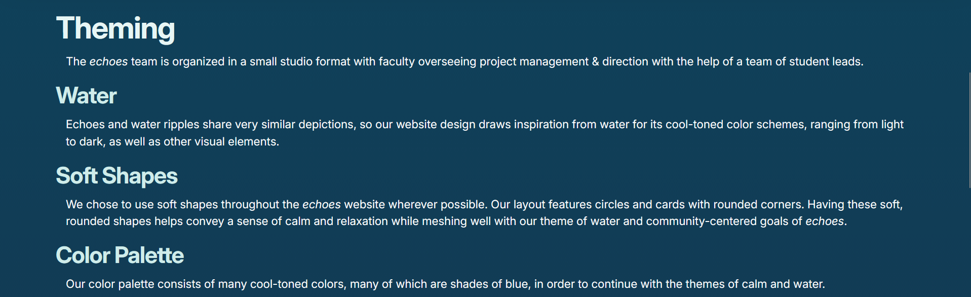
There was some basic info about general styling.
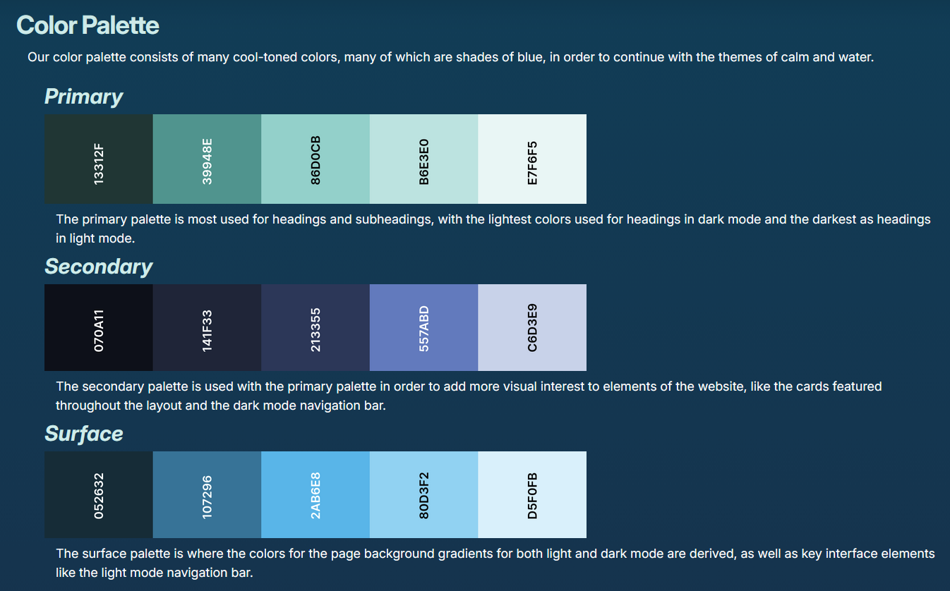
There was also some basic color palette info, but the colors were only in hex codes and the use cases were quite vague.
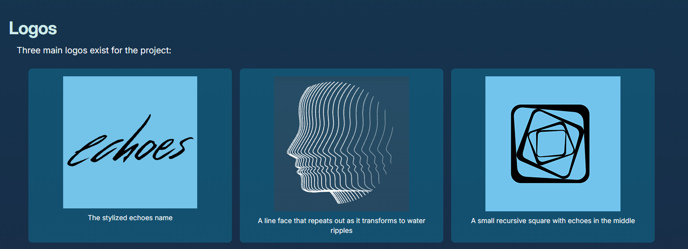
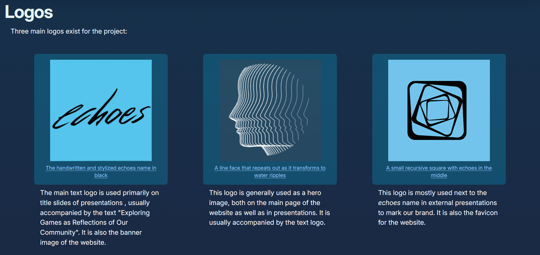
There were logos on this page as well, but they didn’t have use cases, only descriptions.
Additionally:
- Being combined with the website info page, a lot of the information was very specific to the website only and not to echoes as a whole.
- There was no info about fonts.
- You couldn’t download the logos by clicking on them (you can on RIT’s official Brand Portal, for example, and I was basing our brand guide off theirs.)
I had some hunches on where to start, but because I am not a marketing or advertising major, Erika Mesh suggested that I reach out to the people at another VIP at RIT called Technically Speaking.
Reaching Out
Technically Speaking is another VIP at RIT similarly run to echoes, but it is run out of RIT’s College of Liberal Arts and focuses on Advertising and Public Relations. Erika suggested that I have them look over the draft of the Brand Guide that I had been working on. I met with them on the 13th of February 2026, and they gave me a ton of useful feedback on the Brand Guide as well as the website in general. I am saving the general website feedback to implement at a later date (probably next semester) (spoilers), but the Brand Guide feedback was super useful and caught a lot of things that I didn’t. For example:
Color Palettes
This is what the website’s color palette looks like internally.
You’ll notice that there are actually more colors per palette in this image than are displayed on the website. For simplicity’s sake, the color palettes on the website only contain every other color. The colors are numbered by hundreds, with 100 being the darkest and 900 being the lightest. The palettes on the brand guide are 100, 300, 500, 700, 900, in that order.
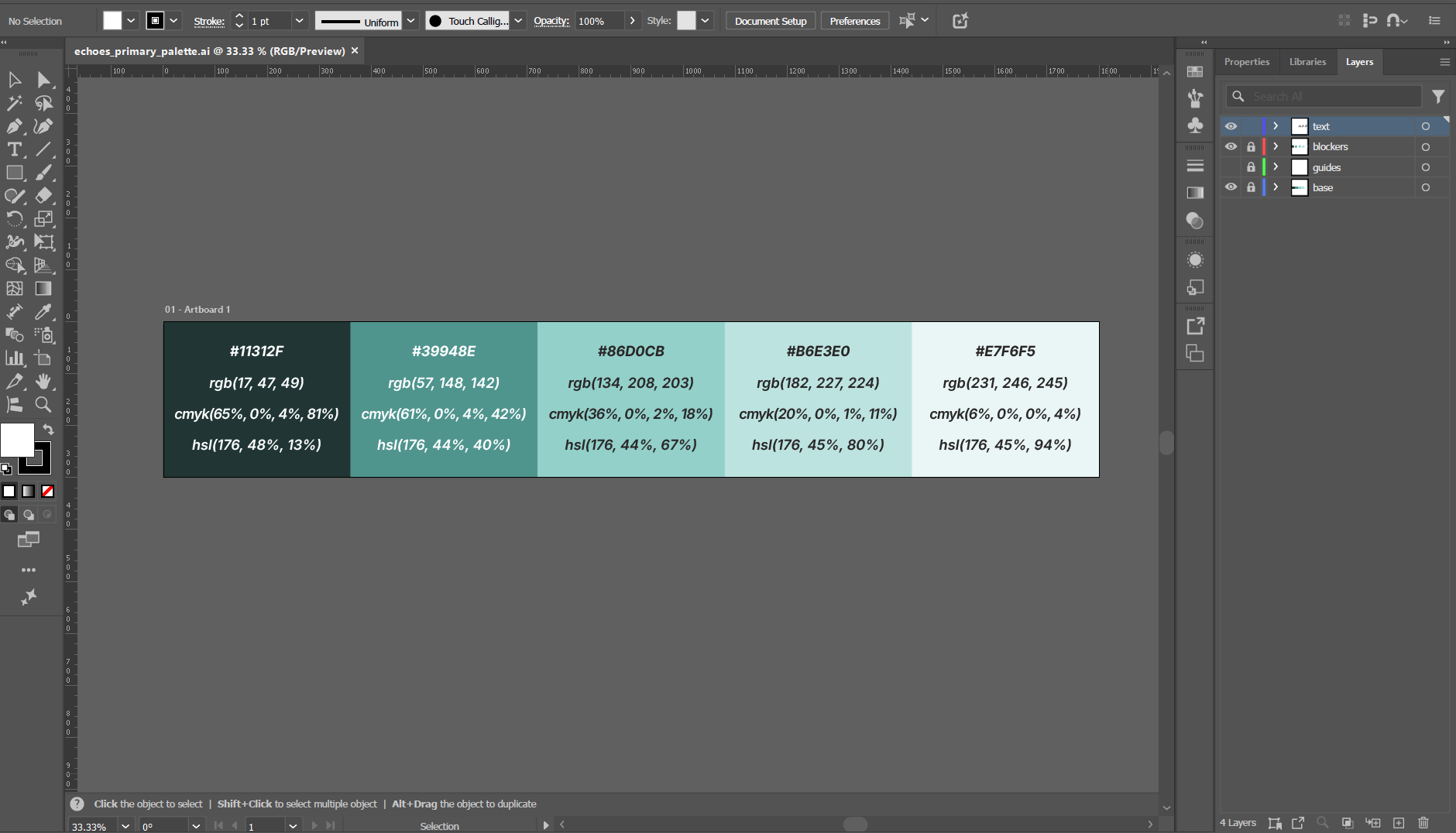
In order to make the palettes you see on the live websites, I had to manually add each color code in Adobe Illustrator.
Use Cases
Something that was also definitely lacking from that original Web Info page was any description of use cases. In addition to defining what to use, it’s also important to define when to use it! A lot of the existing documentation would just say “This is this logo” or “This is the primary color palette” and not define what that meant in the context of echoes. Part of the work that I did on the brand guide was going through past presentations and publications of echoes, both internal and external, and figuring out when each logo/color/header was used and then putting that into words.
This was a bit harder to research than the more tangible elements of our brand because it’s not like use cases were written down anywhere in the code like hex codes or logo PNGs were; I had to analyze how these things were being used already and describe it in a way that would make sense to someone unfamiliar with the project. In particular, the Brick City Homecoming 2025 presentation was super useful. Moral of the story? Always keep archives and documentation because you never know when it’ll be useful.
I Don’t Like This Specific Part of the Website
Fun side tangent for you all: When I went in to make the logos downloadable, the one on the left was suddenly slightly higher than the other two, and I could not figure out why. Somehow, Zachary Ayers added a tiny margin to the top of the left logo and it fixed the entire thing. I never want to touch this again, but I probably (definitely) will.
Conclusion: The Importance of Documentation
Due to the nature of VIPs, it is important to document everything to maintain consistency between semesters as people leave and join the project. Especially with how short our semesters can be, it’s important to streamline the onboarding process as much as possible. I was lucky enough to join a Web team that hit the ground running this past semester, and so my goal with the Brand Guide was to streamline that process however possible for future semesters. In addition, it is also useful to other echoes developers trying to fulfill their presentation requirement (many people told me they found the brand guide useful this semester!) as well as people outside of echoes who are trying to write about the project.
What’s Next?
The brand guide is intended to be continually updated as we refine our brand and develop new standards. For example, I recently added a “videos” section to host our new Imagine RIT 2026 video. I also went in and specified font sizes for each header level and the body text. Next semester, I want to add use cases for the light and dark themes and define what each color on the palette is called internally (like 100, 300, etc.) It’s very important that we keep updating this page because it contains a lot of important information and I’m glad I took the time to make it. Thank you for reading about my work!